For my experimental type project, I would like to create a short animation in Adobe After Effects displaying in a fun and creative manner how the crystalline cobalt salt works in absorbing oxygen from surrounding areas. The end of the video could display short and quick facts about the newly created crystalline material, along with potential benefits.
I plan to create it by using O’s create the frame of a word, possibly the word “breathe.” I could display it in pink, the original color of the crystalline material before it has absorbed oxygen. From reading on how the mechanism works, oxygen atoms basically attach themselves to the cobalt base of the substance, replacing the nitrogen ones that were previously there. I could depict this by having blue oxygen atoms in the shape of O’s gravitate toward the word “breathe,” replacing all of the pink O’s. As they overlap the pink O’s, I could have them turn into a dark purplish color, representative of how the crystalline material looks when it is saturated with oxygen. I plan to have the word “breathe” dive into the water, and through the use of illustrators and sound effects, I think I can make it fairly believable that the word represents something, perhaps a fish. It could just swim around, both releasing and absorbing oxygen. While that occurs, I could have small air bubbles, again in the shape of O’s being released and floating towards the surface. Some of the O’s could enlarge and display information inside their counters about the crystalline material.
The materials that will be necessary for me to complete this will be a computer with internet access, and the programs Adobe Illustrator, Adobe After Effects, and possibly Adobe Photoshop. I will need the internet access to do research and find sound effects that will fit my video.
I do not think that the video should cost anything to produce, because all of the programs will be accessible through the Millersville University design lab. If necessary, I might need to find objects and drop them into water to visually see how the water looks, sounds, and reacts. If that is the case, then I might need to spend money for those materials, although I do not imagine I will need to do that as long as I keep the animation fairly simple.
Tuesday, March 17, 2015

Monday, March 16, 2015
Week 8 - SXSW Poster Update

Above is basically my final design for the poster, though some things may change, depending on if the final project is due tomorrow, or if it will be an in-progress critique, given we did not have last class due to weather. I wanted to go with the low-poly design, because triangles are considered to be associated with the "hipster" and indie genres. More importantly, the triangle plays into the idea of 3 sides, and how Danny Harley is responsible for 3 aspects of his music being the producer, singer, and songwriter. For that reason, I tried to repeat the number 3 in various designs throughout the composition. They also help to reiterate the typeface that I created for the band's name at the top with all of the angles and triangles found within the letters. I also decided to go with the blueish and purple tones and hues, because they help to reinforce the calm and almost psychedelic, euphoric sound representative in his music. The first typeface that I created is found at the bottom, where it says "SXSW Austin, TX 2014." I placed that at the bottom left so that it would not distract too much from the band name, and also because Danny Harley's eyes direct the viewer to the text, to keep the viewer moving around the entire composition. The second typeface is found in the band name.

This is the first draft that I created of the poster, when I was still working on the typeface for the band name and planning out where I wanted to position all of the body text. I figured that the typeface I had for the body text at the bottom did not go with the band name, so I had to create that separately. I ended up changing the A, G, S, and I a little bit.

This is another in-progress pic. Here, I had started to mess with the color of the background, along with the band name's typeface. I wanted a typeface that would look modern, and also reiterate the idea of triangles, almost resembling the constellations in stars to once again reinforce the psychedelic ambient sound.


At this point, I had continued to mess with the colors of the typeface and background. I also used the eyedropper tool and began filling in the triangles that I had previously created. I thought it looked interesting having the contrast between the framework of the low-poly design versus having it actually filled in.

Again, I changed the colors, trying to find a color scheme that would be both exciting while maintaining the calm and tranquil feeling of his music. I also tried changing the corners and end caps of the typeface to see if it would look better pointed rather than rounded, because all of the triangles have sharp corners. I changed the color of the border to an off-white, almost lavender color to compliment the blueish/purplish color scheme, and added in my first typeface for the body text at the bottom left. At this point, I had completed the low-poly design of his face and body. I think the colors here are starting to work together more than in the previous versions, especially with the darker cooler background.

Here, I decided to add in what could be interpreted as mountains or trees far off in the distance. The composition seemed to need more values and also more interest. The body text at the bottom was rearranged and realigned, so that it would match the alignment of the band name better, rather than having it previously appear to create the form of a square or rectangle. This was going to be my final design, but I still felt that it lacked enough to tie in the low-poly design of Danny Harley.

Here are many of the cluttered guide lines that I used in order to create the band's typeface, and also for realigning certain other elements on the page, such as margins and where I wanted Danny Harley to be. Not all of the guidelines are necessary anymore, but I thought it was interesting to see how many of the guidelines ended up matching up with certain features on the composition. For an example, two guidelines outline the width of his earring, the width of his eyebrow on his left eye, his eyes, his pupils, the bottom of his nose, etc. Some of it was unintentional while others were intentional, and it's just very interesting to see how much everything relates to each other once done.

Above is the image that I used, after I had edited it in Photoshop to change the levels, curves, and color balance. I wanted it to appear sightly more purplish and blueish while also bring the shadows forward more, because I figured I would be able to accentuate those colors once I moved it into Illustrator.

This is the original image of Danny Harley.


Above are some sketches that I created in order to further develop the typeface that I wanted for the band name. It was difficult deciding between if I wanted the name to be in all uppercase, lowercase, or a mix of the two. I went with all uppercase, because it was easier to design following the geometric design. The "G" that I created here ended up being changed once I started putting it all into Illustrator. My overall composition idea also changed. I wanted to depict perhaps a person reaching upwards towards the sky, maybe for a balloon or kite to play in with the band name, but I felt that it might be a bit cliche.
Above is the tutorial that I watched on how to create the low-poly design. Although it was done in Photoshop, I added and manipulated the same principles in Illustrator, and it seems to have worked out fine. On the plus side, it is now vector based, so it can be scaled larger.
Monday, March 2, 2015
Week 7 - South By Southwest Band & Sketches
For the South-by-Southwest Poster project, I am choosing to design one for the band The Kite String Tangle.
The Kite String Tangle consists of one member, and his name is Danny Harley. From Brisbane, a city located in Queensland, Australia, he single-handedly creates all of his music, taking the roles of singer, songwriter, and producer. TKST has gained fame by performing at events such as South-by-Southwest in 2014 and the Coachella Festival. "Given the Chance" from his latest album "Arcadia" has gained popularity over recent months. He has accumulated over 1 million plays on Soundcloud, and took the #19 spot on Triple J's Hottest 100 list in 2013.
I first discovered his music from the following URL after doing a Google Search for "South By Southwest 2014 best":
http://www.people.com/people/article/0,,20794792,00.html
He reminds me a bit of a cross by Bastille's vocals and Kygo's rhythm. By far, I would also say I enjoy his music much more than the other band's and artist's that I have listened to.
8 Words That Describe TKST and their style:
Indie
Electronic
Reverb
Ambient
Modern
Tranquil
Progressive
Deep
Below are a few videos of his that I enjoyed and found to be both inspirational and informative in describing his music style:
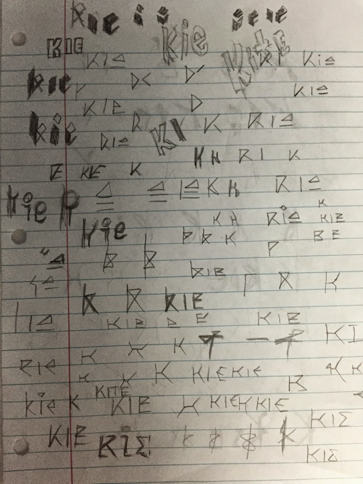
I do not think the font that I have already created works well with the style of the band. My 20 sketches for my next font are shown below.



Resources:
https://www.triplejunearthed.com/artist/kite-string-tangle
http://www.people.com/people/article/0,,20794792,00.html
The Kite String Tangle consists of one member, and his name is Danny Harley. From Brisbane, a city located in Queensland, Australia, he single-handedly creates all of his music, taking the roles of singer, songwriter, and producer. TKST has gained fame by performing at events such as South-by-Southwest in 2014 and the Coachella Festival. "Given the Chance" from his latest album "Arcadia" has gained popularity over recent months. He has accumulated over 1 million plays on Soundcloud, and took the #19 spot on Triple J's Hottest 100 list in 2013.
I first discovered his music from the following URL after doing a Google Search for "South By Southwest 2014 best":
http://www.people.com/people/article/0,,20794792,00.html
He reminds me a bit of a cross by Bastille's vocals and Kygo's rhythm. By far, I would also say I enjoy his music much more than the other band's and artist's that I have listened to.
8 Words That Describe TKST and their style:
Indie
Electronic
Reverb
Ambient
Modern
Tranquil
Progressive
Deep
Below are a few videos of his that I enjoyed and found to be both inspirational and informative in describing his music style:
I do not think the font that I have already created works well with the style of the band. My 20 sketches for my next font are shown below.
Of all of my sketches, I think some of the most successful ones are from the second page, particularly numbers 14 through 17. They are geometric and seem more modern, while reflecting the indie style of The Kite String Tangle.
It was difficult creating the letter K in a creative way without having it appear like other letters such as R or B. I also think it may have been better to choose a different letter than I, perhaps T, because it was fairly difficult to alter the I in a way that it would still be recognizable as one.
Below are sketches that I did in between before I decided on some final designs for the critique.
Resources:
https://www.triplejunearthed.com/artist/kite-string-tangle
http://www.people.com/people/article/0,,20794792,00.html
Saturday, February 28, 2015
Week 6 - In-Class Bibliography Assigment
This is the bibliography that I created with HTML and CSS that was meant to be done in-class with the sources already provided by Professor Mata. I will post Project 3, in which I recreate this with my own sources and change the CSS soon once I have completed it. Below are screenshots of my HTML, CSS, and how the bibliography looks once loaded into the web browser.
 I apologize that the text may be individually difficult to read, because my monitor's resolution is 1440px by 900px, so I had to reduce the size of the entire browser window, which shrunk everything else accordingly.
I decided to use Georgia as my font. It was difficult getting the top and bottom of the container's padding to look equal with the padding on the left and right of the container. At one point I was able to achieve it, but it required me to change the padding and margin in the h1 and h2 elements. I tried to only alternate the size, weight, and lettercase. I might have been allowed to, but unfortunately, because I missed class when we went over this assignment, I was unsure and decided to not change the margins or headings to be on the safe side.
I changed the h1 element to uppercase, keeping the font-weight as normal, and change the size to 45px.
I changed the h2 element to small-caps via font-variant, the font-weight to 600 so it would appear bold, and the font-size to 25px.
Looking back at it, I think I may have been able to change the line-height of the headings, which might have visually balanced the margins and paddings better.
I decided to go with a mint green background, because I thought it was a fairly soft and pleasant color that contrasted the black text well.

I decided to use Georgia as my font. It was difficult getting the top and bottom of the container's padding to look equal with the padding on the left and right of the container. At one point I was able to achieve it, but it required me to change the padding and margin in the h1 and h2 elements. I tried to only alternate the size, weight, and lettercase. I might have been allowed to, but unfortunately, because I missed class when we went over this assignment, I was unsure and decided to not change the margins or headings to be on the safe side.
I changed the h1 element to uppercase, keeping the font-weight as normal, and change the size to 45px.
I changed the h2 element to small-caps via font-variant, the font-weight to 600 so it would appear bold, and the font-size to 25px.
Looking back at it, I think I may have been able to change the line-height of the headings, which might have visually balanced the margins and paddings better.
I decided to go with a mint green background, because I thought it was a fairly soft and pleasant color that contrasted the black text well.
Thursday, February 26, 2015
Week 6 - Overview
I did not make it to class on Thursday.
During Tuesday's class, Professor Mata showed us how to work with Fontographer a bit more, and how to adjust the kerning between our glyphs, as well as between individual pairs. I will still need to go in and adjust that after I delete the boxes surrounding my letters.
She also introduced us to our next project, which is a poster for South By Southwest. I have no chosen a band out of the ones available yet, but I have listed a few that I have in mind, and I will update later once I have decided.
I am trying to find a band that will fit the typeface that I created, but so far, it does not seem as though any of them match it too well. I may have to just choose a band that I fairly enjoy, and create an entirely new typeface for the band's name.
At the end of class, I talked to Professor Mata about my idea of creating a typeface for the new crystalline material that is capable of absorbing oxygen. I misunderstood the original assignment, but after talking to her, she gave me a few ideas. One of them is to create the word "breathe" or something that symbolizes the crystalline material, and to then animate it in After Effects in a way that it reflects the material. For an example, I could have the word "breathe" diving into water and floating around, as bubbles are released from it to show the oxygen rising. I could also change the color of the word to reflect when it absorbs and releases oxygen, much like a pulsing effect. I could then also have words come in from the bottom or side providing information about the new material.
After Effects is a program that I am still currently learning to become more proficient with, but I think this may be a possible task to complete. I will need to do some sketches and illustrations in Illustrator, as well as maybe add some effects or filters in After Effects to see if I can get a promising composition.
During Tuesday's class, Professor Mata showed us how to work with Fontographer a bit more, and how to adjust the kerning between our glyphs, as well as between individual pairs. I will still need to go in and adjust that after I delete the boxes surrounding my letters.
She also introduced us to our next project, which is a poster for South By Southwest. I have no chosen a band out of the ones available yet, but I have listed a few that I have in mind, and I will update later once I have decided.
I am trying to find a band that will fit the typeface that I created, but so far, it does not seem as though any of them match it too well. I may have to just choose a band that I fairly enjoy, and create an entirely new typeface for the band's name.
At the end of class, I talked to Professor Mata about my idea of creating a typeface for the new crystalline material that is capable of absorbing oxygen. I misunderstood the original assignment, but after talking to her, she gave me a few ideas. One of them is to create the word "breathe" or something that symbolizes the crystalline material, and to then animate it in After Effects in a way that it reflects the material. For an example, I could have the word "breathe" diving into water and floating around, as bubbles are released from it to show the oxygen rising. I could also change the color of the word to reflect when it absorbs and releases oxygen, much like a pulsing effect. I could then also have words come in from the bottom or side providing information about the new material.
After Effects is a program that I am still currently learning to become more proficient with, but I think this may be a possible task to complete. I will need to do some sketches and illustrations in Illustrator, as well as maybe add some effects or filters in After Effects to see if I can get a promising composition.
Monday, February 23, 2015
Week 6 - Fontographer
I have moved my illustrator files of my mixed/created typeface over to Fontographer. Thank you Ty for helping me with that.

Friday, February 20, 2015
Week 5 - Overview
Class on Tuesday was cancelled due to a delay with the onset of bad weather conditions.
I also missed class on Thursday. I heard from classmates that we started to work with Fontographer, which I will need to learn and use. I have looked over the new bibliography assignment which I plan to continue this weekend. The second bibliography will be completed hopefully on Wednesday, if not earlier. Amber has added more to our Webydo webpage, particularly on the menu, so thank to you her. The page itself was expanded so that the container fills the entire width of the screen, so some of the items had to be moved around.
I also missed class on Thursday. I heard from classmates that we started to work with Fontographer, which I will need to learn and use. I have looked over the new bibliography assignment which I plan to continue this weekend. The second bibliography will be completed hopefully on Wednesday, if not earlier. Amber has added more to our Webydo webpage, particularly on the menu, so thank to you her. The page itself was expanded so that the container fills the entire width of the screen, so some of the items had to be moved around.
Subscribe to:
Posts (Atom)